Azile Nuñez
[ah-zeel noon-yez]
Filipino-born graphic designer based in Canada. Specializing in brand design, she draws inspiration from her surroundings, always exploring creative possibilities.
creative direction + design assets + marketing ads
Seed2Stone
Seed2Stone is a Brooklyn-based brand specializing in ethically sourced lab-grown diamonds. Founded by women, the company is dedicated to providing affordable luxury while maintaining high standards of quality.
Brand Designer [Internship]
seed2stone
In my role as a brand designer, I developed a cohesive brand book and style guide template that aligned with the company’s ethos. I also had creative freedom to produce visual concepts for product ads and Shopify website banners, while designing brand assets and digital materials to support marketing efforts.
Brandbook and Style Guide Template
The Brand Book and Style Guide that I created will establish a clear and distinctive brand identity, ensuring that Seed2Stone’s visual and verbal elements create a memorable presence in the market.
The style guide will provide comprehensive guidelines to maintain consistency across all marketing materials, including digital platforms, print, packaging, and advertising. It aims to enhance brand recognition by developing a strong and unique image that differentiates Seed2Stone from competitors and resonates with the target audience.Additionally, the guide will support brand growth by equipping internal teams and external partners, such as graphic designers, advertising agencies and investors with the necessary tools and knowledge to represent and promote the brand effectively and efficiently.
While exploring layout options for the templates, I also developed patterned assets that can be integrated into the S2S graphics to enhance the visual appeal of their posts.
While exploring layout options for the templates, I also developed patterned assets that can be integrated into the S2S graphics to enhance the visual appeal.
*patterned graphics
*Seed2Stone Instagram posts
*Seed2Stone Newsletters
.
.
Flat Back Studs Launch
Seed2Stone launched a new earring category, “Flat Back Studs”. It aims to change the security, convenience, and comfort of earring studs.
Idealizing a banner at first, I turned it into a 30-second launch video on social media [Meta] that then got used as a brand and product ad. The launch video highlights the diversity that Seed2Stone offers within its company and products. I showcased a variety of in-demand jewelry choices and styles—ears and nose piercings.
There was a challenge in determining where to showcase the launch video. To address this, I created a GIF version that features key sections of the video.This allowed S2S to use a GIF banner on the launch page and a 1:1 GIF featured on their homepage.
*Seed2Stone Flat Back Studs page
Shopify Page Banner
Seed2Stone is exploring ways to refresh its Shopify Banner on one of the pages with the most traffic. After launching Flat Back Studs which gained popularity with their loyal consumers as well as attracted new ones, they have decided to bring to light their versatility in the market by promoting their Ear Cuffs.
The banner that I created aims to enhance and effectively communicate the brand personality and call-to-action mainly to engage with the consumer and present the assortment of ear cuffs digitally. After analyzing other jewelry websites and competitors, I came to a decision to bring up using a GIF for the banner. Compared to the traditional static banner, Seed2Stone has started to implement GIFs to inspire and pique our customer interest.
*Seed2Stone Ear Cuffs page
TikTok Videos | META Posts
Seed2Stone is pushing their products by delving into their social media management. Kicking off their TikTok account would be a series of three videos encompassing the introduction of their brand and what their customers should expect.
Being given the videos and images to work with, I edited them in a way that the ads would appeal to TikTok or Facebook users who would align with Seed2Stone's target customers. Both medias aim to increase brand awareness and engagement with their target and potential customers. It highlights the quality of the jewelry that they sell and offer.
*Seed2Stone TikTok Promos
*Seed2Stone META Ad—Video
*Seed2Stone META Ad—Still Version
testimonials
Amy Levine, Seed2Stone CEO/Founder
"a very thoughtful designer with an experimental mindset who prioritizes the concept before execution, ensuring creative solutions that align perfectly with the project's needs"
“I love working with Azile. She is a very thoughtful designer that is thorough in her project intake and process. Azile takes all the information in and digests it properly before asking relevant questions to ensure she is on the right track. She is incredibly creative with an experimental mindset.. The concept comes first before she figures out execution and due to her commitment to the project, she will always find a creative solution that matches. I highly recommend her to anyone who is lucky enough to meet her.”
Melanie Godfrey, Seed2Stone HR/Operations
"possesses an incredible creative vision and consistently brings fresh, innovative ideas to the table while executing complex ideas efficiently and with exceptional quality"
"I had the pleasure of working with Azile as a graphic design intern, and she has been an absolute standout. From the very beginning, it was clear that she possesses an incredible creative vision that sets her apart. Azile approaches each project with a remarkable level of thoughtfulness, ensuring that every detail aligns with the larger goals and vision of our seed2stone brand. Her ability to execute complex ideas efficiently while maintaining a high standard of quality is truly impressive. She works through each task with precision, always delivering designs that exceed expectations. Azile's attention to detail and her consistent ability to bring fresh, innovative ideas to the table have made her an invaluable asset to our team. I have no doubt she will continue to thrive in her career and am excited to see where her talent takes her."
.
.
Before diving into the templates, Seed2Stone provided me with their brand pitch deck, consumer personas, ideal customer profile, and logo and typography suite.Using these as references, I conducted a thorough brand analysis. After taking notes, I developed a tailored project deliverable, cross-referencing insights from a previous brand project guide. Following a collaborative meeting to propose the structure for the brand book and style guide, I began crafting the Seed2Stone Identity book
.
.
.
.
.
.
.
.
.
.
.
.
.
.
..
.
.
.
I began curating visual inspirations and defining the overall feel for the templates.Experimenting with slide layouts and content, I explored colour combinations that aligned with accessibility standards
.
.
.
.
.
.
.
.
.
.
.
.
.
.
.
.
.
.
.
.
.
.
.
.
Following weeks of draft presentations and feedback on aesthetics, orientation, and colour combinations during our weekly meetings, I began adapting the layouts to Google Slides for easier accessibility. However, after discussions, we decided to finalize the template in Canva, as it’s Seed2Stone’s primary tool for managing their assets.
.
.
.
.
.
.
.
.
.
.
.
.
.
.
.
.
.
.
.
.
.
.
..
While transitioning the finalized brand book to Canva, I also developed the framework for the Style Guide and presented the initial design draft.
.
.
.
.
.
.
.
.
.
.
.
.
.
.
.
.
.
.
.
.
..
.
.
Creating the template for the Style Guide was more straightforward, as it’s a simplified version of the Brand Book in design while maintaining some design unique to itself.
..
.
.
.
.
.
.
.
.
.
.
.
.
.
.
..
.
.
.
.
.
After refining the drafts based on feedback, I created the Style Guide template in Canva, following the same process I used for the Brand Book. I made sure to add the grid lines I used for both templates.
Week 1 & 2, Figjam Board. Brand Analysis + Framework draft [9 secs]👇
Week 3, Figma. Moodboarding + First design draft 👇 [8 secs]
Week 4 & 5, Figma. Template size orientation/format + final draft + Google slides transition [15 secs] 👇
Week 6 & 7, Canva & Figma. Finalized Brandbook on Canva +
Styleguide Framework Draft + First design draft [6 secs] 👇
Week 8, Figma. Design drafts [3 secs] 👇
Week 9, Figma & Canva. Final design draft + Style guide on Canva 👇 [6 secs]
.
.
During the brand analysis, I curated a Pinterest board to encapsulate Seed2Stone's essence. It highlighted keywords such as women, stylish, accessories, mid to upper-class, 30-50s, millennials, eldest Gen Zs, gift-giving, social butterfly/extroverted, authentic, trendy, self-love, and family-oriented
.
.
.
.
.
.
.
.
.
.
.
.
..
.
.
.
.
.
.
.
.
.
.
.
I came up with the following ideas:Interactive Pop-Up → Blog/Page
A dynamic pop-up teases the new product with a call-to-action like "Discover the story behind our latest collection." Which leads to a blog page that shares the design journey, product features, and lifestyle benefits.Magazine-Style
An editorial-style graphic that combines lifestyle imagery and product details. The design features bold grids, torn-edge effects, and modern typography to create a clean, stylish aesthetic."What, Why, When, Where, How" Series
A series of banners that answer key questions about the product launch. It could be a carousel to engage users and build anticipation.Tear Effect Pop-Up
A bold pop-up animation uses a "tear" effect to reveal the product behind it. This striking visual pairs perfectly with a brand tagline like.
The first few drafts I showed were of a tear effect and magazine-like graphic style just to have a visual example out of the moodboard I made for the project.
.
.
.
.
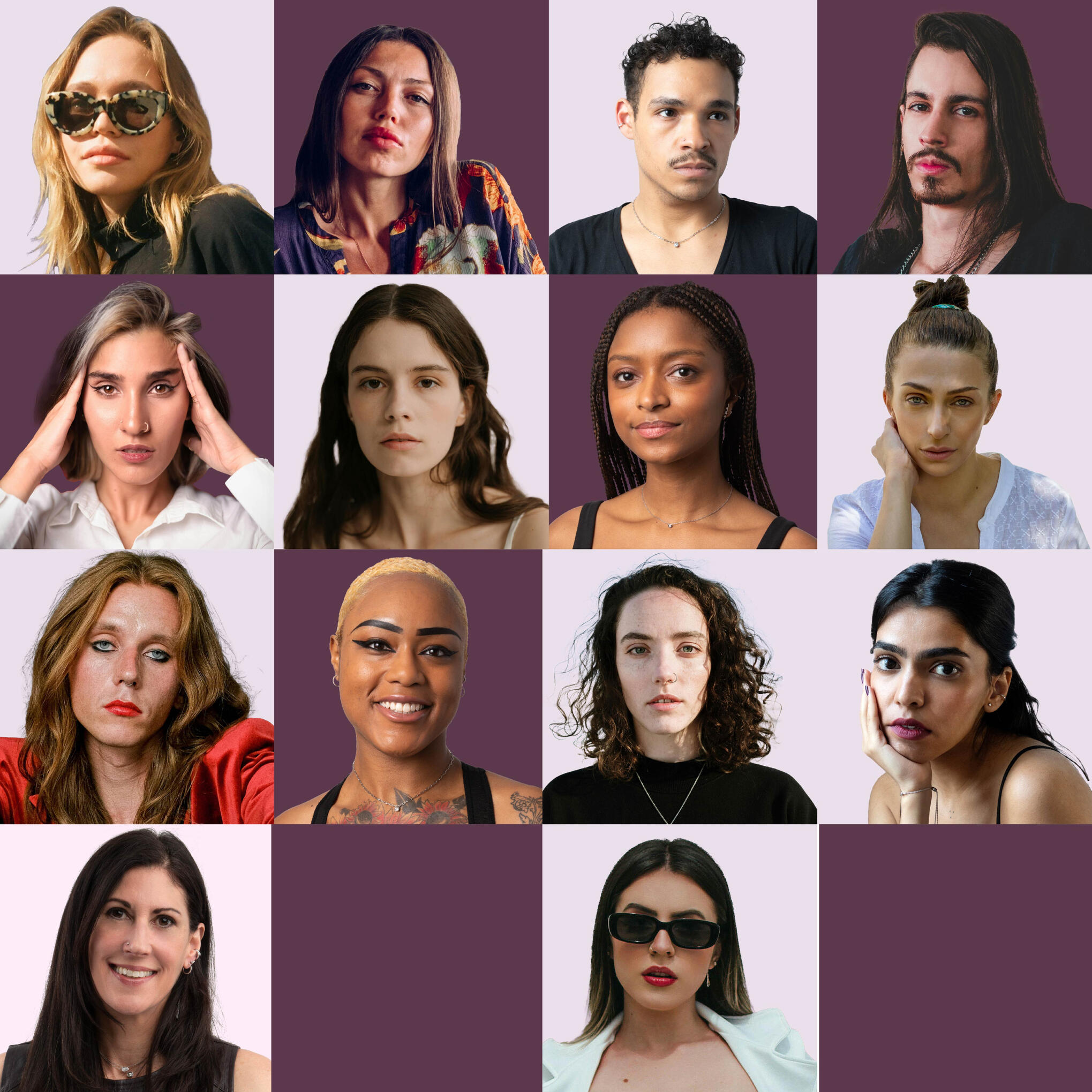
I discussed visualizing and exploring ideas of fragmented portraits that highlight the parts of the face—where jewelry could be worn. A collage of portraits was suggested, still focusing on different body parts.Inspired by Michael Jackson's Black or White MV, we emphasized refining the concept into one clear direction: showcasing S2S pieces worn by different personalities to convey the versatility and connection of the S2S jewelry to everyday life with its customers.
After presenting the first draft of the portrait collage, the team was especially drawn to the tear effect and how different facial features from various images were blended into one portrait. Following their feedback, I received additional portraits of S2S models, which I incorporated to further refine the material.
.
.
.
.
.
.
.
.
.
.
.
.
.
The team loved the direction and provided feedback to refine the pacing, focus, and imagery. They suggested using actual model images, zooming in on ears and noses, and keeping text minimal with "Flat Back Studs" and "Coming Soon" on the final slide. Dropbox images will replace placeholders, with a cleaner ear image and refined nose shots switching between male and female models.
We then explored ways to use the blocks creatively for text placement and showcasing jewelry, adding more visual interest to the graphic. When jewelry pieces were added, it became clear they needed to stand out more. This led me to focus on zooming in on ears and noses—key areas where flat-back studs are commonly worn. These insights also prompted simplifying the tear effect into clean squares and rectangles and transitioning the project from a static banner to a dynamic 30-second video promo.
.
.
.
.
.
.
.
.
.
.
.
.
To explore the concept further, I incorporated royalty-free images that represent S2S's customer personas—on top of the portraits S2S had. It essentially highlights the brand message—serving diversity with the comfort of their jewelry pieces.
After the project was done, an from the ad adviser of the team tasked me to adjust sizes—orientations for Instagram and TikTok—and make minor tweaks. Changes include using specific models and product images on certain frames as well as texts, and creating alternate versions of “Coming Soon” (e.g., “Just Launched” for Version B).
Week 1, Pinterest. Moodboarding + Ideations [15 secs]👇
*Week 2, Figma. Moodboarding + Sketches [13 secs]👇 *
Week 3-4, Figma. First design Draft👇 [2 secs]
Week 5-7, Figma. Collage design Draft + Launch Video drafts👇 [14 secs] + Portrait images
.
.
.
The team emphasized the need to prioritize advertising S2S products on META and TikTok. I was tasked with analyzing previous S2S META ads to use as a reference, ensuring the new ads align with the S2S brand. This approach will guide the creation of META Ads and TikTok brand videos that resonate with the target audience.
.
.
.
Creating the META ads came naturally, as I’m familiar with S2S branding, and there was already a working ad that just needed a more polished, sophisticated touch. After presenting drafts, it quickly became clear which designs would be used for media or as references for future marketing posts.
.
.
.
.
.
.
..
.
.
.
.
.
.
.
.
.
.
.
.
.
.
..
.
.
.
.
.
.
.
.
.
While working on the META ads, I also edited the video files provided by the team to create a brand product review video for TikTok.The TikToks will feature two ads: one highlighting flat-back studs through a short testimonial and another presenting S2S as a brand and its core values.
The initial ad testing will guide future TikTok postings, targeting late-30s, higher-end customers seeking quality jewelry. Each ad will focus on capturing attention within the first three seconds of the video.
I began working on five videos: four featuring one person, totaling 1 minute and 20 seconds, and one featuring another person at 1 minute and 30 seconds. I started with the four videos, repurposing them into one distinct edit—highlighting why customers should choose S2S.
.
.
.
.
.
.
.
..
.
.
.
After presenting the first two videos, I edited the remaining one to match the same composition but made it more in-depth and tailored to S2S's target customers, ensuring it spoke directly to their specific needs and preferences.
With input from the team, we decided to experiment with the intro clip graphics, resulting in a more dynamic and engaging opening that effectively grabs the viewers' attention right from the start.
.
.
.
.
.
.
.
.
.
.
.
.
.
.
.
.
.
While wrapping up the TikTok videos, we revisited the META ads and decided to create a new version featuring the illustrated ear graphic of S2S. This line-art illustration had previously been used in a well-performing ad, so we incorporated it into the new version to maintain consistency and capitalize on its success.For the next two weeks, I started playing around with CapCut to visualize different ways we can incorporate the product images along with the ear-illustration.
.
.
.
.
.
.
.
.
The concept I decided on for the animated ad involves blending real ears with an illustrated style. I was invited to a Canva file, where the team shared images of earrings to ensure the cohesiveness of the shadows I will use for the jewelry. It was preferable that the layouts include six S2S jewelries in golds and silvers, and that I'll have the freedom to play around with the design.
Three different sizes of earrings will be created for various presentations of the product. I explored how to incorporate product images alongside the illustration in a way that complements the overall aesthetic of S2S.
.
.
.
.
.
Out of the sketches I presented, the team loved the one featuring the hand illustration. They found it intriguing and a perfect fit to emphasize the illustration theme. I featured the stacked ear cuffs and small hoops, avoiding real ear images and focusing solely on hand-drawn elements and product visuals.
.
.
.
.
.
.
.
.
.
.
.
.
.
.
.
..
.
.
.
.
..
It was suggested that I refine the concept further by experimenting with jewelry placements to highlight multiple ways they can be worn. I received the raw jewelry images, allowing me to edit them freely. Using Photoshop and referencing the S2S website, I applied photo grading and made adjustments to showcase the jewelry at specific angles, adding depth to the illustration and enhancing the overall design.
I focused on working with the silver jewelry and sent my file to the team, allowing them to recolor the pieces to gold as needed.
.
.
.
.
.
.
...
..
.
.
.
As I finalized the orientations needed from the TikTok Videos and tweaking little things here and there, the three marketing videos were done and ready to be uploaded. The next meeting then talked about making a still version of the META video Ad, so I went back to Canva to arrange some layout for marketing usage.
Week 1&2, Canva + CapCut. Drafts and Ideations [5 secs]👇
Week 2-4, CapCut. [30 secs]👇
Week 5-6, Canva + CapCut. Reworking the Intro clip for the Videos [5 secs]👇
Week 7-8, Canva + CapCut. Reworking the META Ads [30 secs]👇
Week 9, Canva + CapCut + Photoshop. Illustration Ad Draft [10 secs]👇
Week 10, CapCut + Photoshop + Canva. Ad Draft and Still version of META video [4 secs]👇